I was staring at a clock the other day when it struck me: the hands look like they’re about to draw swords. Long, thin blades set to cross at twelve, ready to duel at dawn or, more accurately, lunch. There’s something oddly menacing about it. One minute, they’re telling the time; the next, they’re reenacting a samurai standoff on your kitchen wall.
This probably says more about me than the clock. But once you see it, you can’t unsee it. The minute hand creeps like a shinobi. The hour hand, thicker, more deliberate. The second hand? A manic ronin, slashing wildly at the void. Tick. Tick. Tick. All action. No explanation.
It’s easy to romanticise it all. Time as an opponent. A relentless enemy. But what if time is the dojo? The arena. The thing we move through, practicing forms, refining strokes. In this reading, we’re not fighting time—we’re learning from it. Or at least designing with it.
Which brings me, naturally, to Miyamoto Musashi.
You probably know Musashi as the undefeated swordsman who wrote The Book of Five Rings. But let’s reframe him as a brand strategist. A minimalist. A guy who knew how to commit to a tone of voice (grim), keep his visual identity consistent (robe, two swords, low ponytail), and deliver compelling, targeted messaging (“do not think dishonestly”).
His teachings weren’t just about swordplay. They were about rhythm, presence, timing. If you’ve ever struggled with a logo redesign, a pitch deck, or the exact right moment to send a client invoice—congrats, you’ve already internalised Musashi. You’re just using different tools.
In The Wind Book, Musashi says:
“In strategy, it is important to see distant things as if they were close and to take a distanced view of close things.”
That’s not just good sword advice. That’s kerning. That’s grid systems. That’s knowing when to zoom in and when to step back. If Musashi had a Behance portfolio, it would be tight, sparse, and terrifyingly well curated.
He believed in doing more with less. Each strike deliberate. Each step meaningful. A perfect metaphor for design, especially in branding, where excess is a liability. Clarity cuts deeper than decoration. And if you’re wondering whether he’d use Helvetica: no. Musashi would carve his own typeface into stone, then make you feel bad for not understanding the negative space.
Branding, after all, is combat. It’s not a nice phrase, but it’s true. You’re constantly engaging with enemies: clutter, confusion, cliché. Your only weapons? Form, function, feeling.
A good brand strikes cleanly. One gesture. No hesitation. Think of Nike. One swoosh – like a blade through air. Apple. One bite – one idea. Even a children’s book can have a decisive voice. When done right, branding doesn’t shout. It slices. It whispers across the room and leaves a mark.
Bad branding flails. It hesitates. It apologises with gradients and begs for attention with busy type. It dies by a thousand cuts, mostly self-inflicted.
To design well is to choose your battle stance. Are you wide and defensive? Narrow and precise? Are you overreaching because you’re afraid to commit? Musashi would say, observe well, then strike once.
It’s tempting to keep tweaking. To relaunch. To iterate endlessly. But remember, the swordsman doesn’t win by polishing his blade forever. He wins by entering the fight.
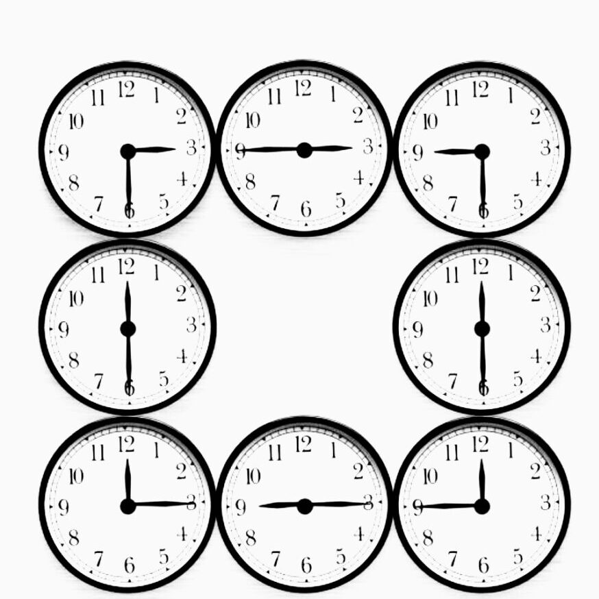
I keep coming back to a small visual I made—four clocks arranged in a square, each with its hands locked in opposing diagonal lines: northwest to southeast, northeast to southwest. Symmetrical. Minimal. Like blades forming an invisible ensō.
I created the image partly by accident (and partly while trying to avoid doing real work). But what struck me later was how balanced it felt. A visual haiku. Something that whispered meaning without ever needing to speak it.
In Japanese design, we often talk about ma—the space between things. This image had plenty of that. Not just the literal space between the clock hands, but the suggestion of time passing between them. Each angle felt deliberate. As if each clock were observing the others in silent respect.
You could read it like a compass. Or a mandala. Or a warning. It reminded me of kakejiku scrolls. Or the calm menace of a shoji screen with someone standing just behind it. You don’t see the face, but you feel the presence. It also felt like a good album cover. Probably experimental jazz. Or lo-fi sword fighting ambient.
And here’s the thing: people love symbols. Especially when they’re not obvious. Design thrives on this. Think of how many logos rely on double meanings—FedEx’s arrow, Amazon’s smile. We want our work to speak a secret language. To say, If you know, you know.
Musashi would approve. He was a fan of the hidden rhythm. The truth between strikes. He even wrote an entire chapter called The Book of Void—which is either deep Zen or the ultimate designer cop-out. Imagine turning in a blank moodboard and calling it your Void phase.
There’s also the matter of clocks themselves. We treat them as tools, but they’re also symbols. Of death. Of structure. Of constraint. Or, if you’re in a more optimistic mood, of movement. Of cycles. Of possibility.
I once had a kind of shower-thought moment, one of those strange, quiet flashes of clarity you get while brushing your teeth or rinsing shampoo—when I realised how comforting the tick of a clock can be. Like the universe is still keeping tempo even if you’re not. There’s something nice about knowing time is always moving, even when you’re not. Especially when you’re not.
Designers often resist time. We push deadlines, extend timelines, wish for more hours. But maybe it’s better to accept the tick. Let it be part of the rhythm. Musashi would. He didn’t fight the flow—he moved with it.
Tick. Step. Cut. Breathe.
We don’t talk enough about decisiveness in creative work. We talk about process, iteration, collaboration—but not the moment of the cut. The moment when you choose. When you let something go. When you say, this is it.
Musashi killed over 60 people with that kind of clarity. You just need to pick a typeface.
Still, there’s wisdom in that energy. Clarity is compassion. Especially when it comes to how people interact with what you’ve made. Good branding isn’t about being clever. It’s about being kind enough not to waste someone’s time.
So next time you design something, ask yourself:
Is this a clean cut?
Does this form have rhythm?
Have I made peace with the ticking?
You might not be Musashi. But you can still strike with purpose.
Author’s Note
I originally thought this piece would be about clocks and ended up meditating on swords. Or maybe I was just hungry. Either way, it came together around an image that felt like it meant more than I could say.
It’s strange how often ideas arrive sideways. Not with a bang, but a soft tick in the corner of the room. Something you notice in passing, like a white moth on a white wall. The kind of thing that’s only visible if you’re not looking directly at it. Also, I don’t actually wear glasses, but I should. I just prefer to misread things creatively.
The next piece will probably be about the colour of sound or the taste of fonts, something equally impractical. But for now, I hope this gave you a small moment of clarity.
Draw. Cut. Sip. Repeat.
Now it’s almost 3am, time for my coffee.
Leave a Reply to Barry Ashworth Cancel reply