At some point, interfaces stopped being things we looked at and became things we moved through, and now they are becoming things we barely see at all because the act of interaction has started to dissolve into something quieter and less defined.
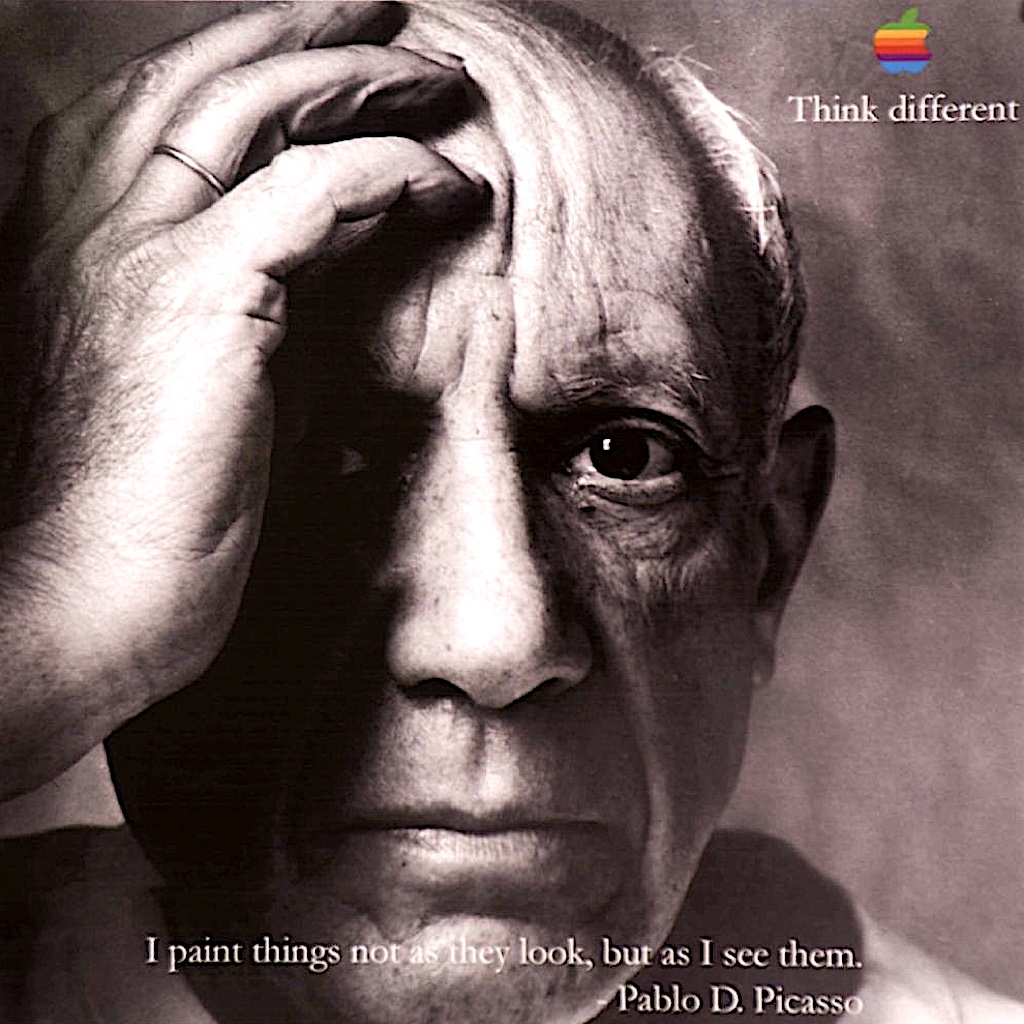
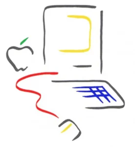
Early computing was visual in a direct and almost naive way where shapes and icons carried meaning through suggestion rather than precision. The original Macintosh symbol, often nicknamed the “Picasso Mac,” carried a loose, expressive quality that echoed the work of Pablo Picasso in spirit rather than intention, as it presented something that looked like a face and a machine at the same time without fully committing to either, which allowed the user to complete the image in their own mind.
It was designed by Tom Hughes and John Casado as a brand mark for the Macintosh division and part of the early visual language of Apple, and what they created was not just a symbol but a small act of interpretation where the system did not explain itself fully and instead left a quiet space for the user to step into.
This space feels close to the Japanese idea of ma, which is not simply emptiness but a pause that gives form its meaning, and the early interface lived comfortably in that pause because it showed just enough and then stepped back without insisting on clarity.
As systems grew more complex, this space began to close and design shifted toward structure and consistency through frameworks like Material Design and Human Interface Guidelines, where everything became clearer and more predictable and easier to understand because the goal was no longer interpretation but immediate recognition, which meant the interface stopped asking questions and started providing answers.
This shift was necessary, but it came at a cost because ambiguity was reduced and with it the quiet sense that the user was part of the experience rather than simply moving through it.
Then softness returned in a different form glass to blur and layered transparency, which gave modern interfaces a sense of depth and atmosphere where surfaces felt lighter and more fluid; yet this softness was controlled because it existed to organize meaning rather than open it, and so while the space between elements became visible again, it no longer carried uncertainty.
And now the interface begins to disappear altogether.
With the rise of artificial intelligence, interaction shifts from navigation to intention where you no longer move through menus or follow paths but instead describe what you want and the system moves toward it, which removes the need for visible structure while increasing the importance of how that structure behaves beneath the surface.
This is not limited to one system but appears across all AI where voice removes the screen entirely and generative systems turn language into images, video, and sound, and tools like DALL·E and Runway no longer ask you to learn an interface but to express an idea, which means the interaction becomes less about control and more about direction.
You are no longer using a tool but directing one, and in doing so the interface does not vanish but relocates into behavior, into timing, into tone, into the way a system interprets ambiguity and responds to it.
This is where visual language expands into something broader because the interface is no longer defined by what is shown but by how something responds, and across all AI systems the same pattern appears where the visible layer recedes and the invisible layer becomes more important, which turns design into something that feels closer to psychology than graphics.
In earlier systems, visual language shaped how we understood machines through form and symbol and structure, but now interaction itself becomes the language and meaning is carried through response rather than representation.
And yet even here the past lingers in small ways through minimal controls and subtle anchors that ground the experience when it becomes too open, which suggests that the interface never truly disappears but simply moves out of focus.
The pattern repeats quietly over time where early design invited interpretation and later design removed it in favor of clarity and now design is learning how to reintroduce it without losing control.
The “Picasso Mac” was not just an early symbol but an early signal of this idea that design does not need to say everything and that meaning can exist in what is left unsaid.
As interfaces fade from view this becomes more relevant because when nothing is shown everything depends on how something responds, and in that moment the interface is still present even if it no longer looks like one.
It sits there in the background like a cup of coffee that has gone slightly cold because you forgot about it while thinking about something else, which is usually a sign that the thing you were using has stopped feeling like a tool and started feeling like part of the moment.
It does not need to announce itself.
⸻
Author’s Note
This started with a small symbol and slowly expanded into something much larger, which either means the idea holds up or I have been staring at old interface design for too long with a cup of coffee nearby that I also forgot to finish.
There is something slightly strange about writing at length about things becoming invisible, but that seems to be where design is heading as tools become less about what you click and more about what you ask, which is a different kind of interaction that feels closer to conversation than control.
The “Picasso Mac” is not an official term and probably never was, but it fits well enough that it has stayed and at this point it feels less like a label and more like a shared observation that people arrive at on their own.
If this feels overthought it probably is, but most things worth noticing tend to start that way and then expand while you are not paying attention, which is also around the time the coffee goes cold again…
Leave a Reply