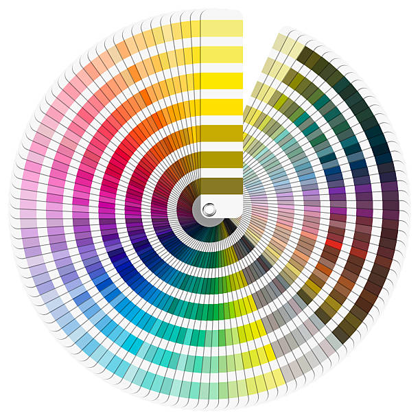
Pantone colors are a marvel of modern design and, for many creatives, a beautiful curse. The Pantone Matching System (PMS) promises worldwide harmony, whether it’s Coca‑Cola red bright enough to stop traffic or Tiffany blue gentle enough to make engagement rings blush. These premixed pigments guarantee that your neon flamingo pink on Tokyo billboards matches the one on your Parisian tote, no matter how many time zones, or Netflix episodes, you’ve crossed.
But let’s be honest: this chromatic precision comes with a sticker shock that could make a unicorn weep. Pantone doesn’t just sell colors; it licenses feelings. Each hue is guarded by a code so proprietary that even your bank account breaks into a cold sweat at the sight of a swatch book subscription. Meanwhile, CMYK and RGB, those open source free spirits, prance around with no boardroom dictating whether they can wear “Midnight Black” or “Cosmic Latte.” It’s the David and Goliath story of color standards, except David still pays royalties.
In Japan, color has long been more than decoration; it’s cultural poetry. Traditional shades carry names like Usuzumi (pale ink) and Kurenai (crimson), each evoking a season, a sentiment, or a status marker. Centuries ago, imperial decree determined who could don certain pigments. An aristocrat’s robe whispered power in deep murasaki (purple), while a peasant’s dyed scalp carried the modesty of unassuming earth tones. This historical hierarchy reveals Shikata ga Nai at its finest: accept the color rules and find beauty within constraints.
Fast forward to the Pantone era, where color codes don’t bow to nobility but to marketing plans and annual budgets. Just ask Tiffany and Co., which spent years in court defending its trademarked “Tiffany Blue,” or Airbnb, whose switch from “rally pink” to “Bélo blue” in 2014 set Reddit ablaze. Even Starbucks once tinkered with its signature green before quietly reverting to the ol’ faithful. These are not palette tweaks; they’re corporate soap operas played out in hex codes. Pantone’s whimsical monikers, Minion Yellow, Rukitan Red, Sizzling Sunrise, feel like Looney Tunes characters auditioning for a branding gig. In contrast, Japanese naming etiquette for people and colors alike emphasizes harmony and meaning over whimsy, reflecting Wa (和), social cohesion. It’s as if Japan curated a zen garden while Pantone threw a confetti party.
Yet beneath the humor lies a shared truth: color is communication. A global brand’s consistent red ignites cravings from New York to Nagoya; a kimono’s precise green signals respect for nature’s rhythms. Whether one speaks Goroawase or Pantone, we use codes to bridge gaps between people and products, emotion and execution. This is Ma (間), the silent space where meaning blooms. A plain gray chip is empty until context gives it life.
But Pantone’s rulebook also inspires rebellion. Just as vintage analog cameras have made a triumphant return, some designers are flirting with “anti Pantone” palettes, open source swatches crowdfunded by indie studios with a manifesto that reads: “Our colors are free, and so is our spirit.” It’s the Kaizen of creative communities, small, continuous improvements to break monopolies, one hex code at a time.
Meanwhile in the West, color trends come and go at viral speed. One month it’s “Millennial Pink,” the next it’s “Gen Z Yellow” flaunted on every sneaker box and smoothie carton. These fads are optimistic fireworks, Mono no Aware writ large, brief bursts of wonder that fade as quickly as they appear. Pantone even nominates a “Color of the Year,” a symbolic emperor crowned and dethroned in twelve months or less.
Perhaps the real magic of Pantone is reminding us that even the most fleeting moments deserve a swatch. When we label a hue “Living Coral,” we invite warmth and optimism into our feeds, our wardrobes, our lives. It’s a modern Gaman, enduring the digital noise by anchoring our senses to a single, meaningful shade.
So what’s our takeaway? Pantone colors are equal parts dictatorship and dream factory, a global pact that says, “We promise to see your red the same way you do.” They charge a toll for that promise, but they also gift us a shared language richer than any emoji. And in a world surfeited with choice, sometimes the simplest code can feel like a love letter.
And honestly, Pantone might be due for its own revival code. With everyone ghosting each other across five platforms, maybe it’s time to get mysterious again. Send someone a number: 17-1463. In Pantone-speak, that’s the fiery “Flame” hue; look it up in your swatch book and let someone decode your heart in vibrant orange-red. Make them decode your heart like it’s a boss battle. (And just to be crystal clear, unlike the old pager code 14106 for “I love you,” these Pantone numbers aren’t secret confessions by default; they’re practical color IDs we’re cheekily borrowing for romantic flair.) Retro romance isn’t just cool, it’s got style. A Pantone chip might not buzz in your pocket, but the idea still does. Quiet. Nerdy. Chromatic. Basically the emotional equivalent of a Tamagotchi: challenging to keep alive, but absolutely worth it.
Speaking of codes, remember our old friend 10146 C? That suffix C stands for “coated,” indicating the finish type of the Pantone chip. It’s the detail that tells printers, “Use glossy paper, please,” so your heartfelt hue looks its absolute best. Imagine whispering love in #C86A25, an earthy orange-brown that feels like toasted marshmallows at dusk. In RGB, that’s (200, 106, 37), and in CMYK it’s a confident 0% cyan, 47% magenta, 82% yellow, 22% black. Perfect for a love note printed on a swatch, though you’ll need the real Pantone book to avoid any pixelated heartbreak.
Author’s Note
If this article made your brain itch for a color chart, you’re guilty of Wabi Sabi, finding beauty in imperfection, like spilled coffee on a watercolor blot. Remember, no color system is flawless; they’re just palettes in a wild world.
I once tried mixing my own “Sunset Ember” at home and ended up with something closer to “Burnt Marshmallow.” It was my personal Kaizen moment, an improvement… that tasted like candy gone wrong.
In the spirit of Omoiyari (compassionate awareness), here’s a reminder: if you love someone, tell them. Don’t wait for Pantone to choose your hue. Unless, of course, you want to send them a swatch of “Distant Indigo.” It says “I miss you” in 18 digits.
Now, go forth and paint the town, preferably within your subscription plan.
Leave a Reply